
Run Charts
Several views from the Analysis tab in Run Metrics Software or the Charts tab in Analysis Software (AS) provide metrics that are useful for diagnosing overclustering.
Severe intensity drops in all channels early in the run can indicate poor template generation due to overclustering. When these drops occur, the software cannot extract intensity information from subsequent images so quality can be poor and the run might fail.
Comparison of Intensity Profiles in Run Metrics Software
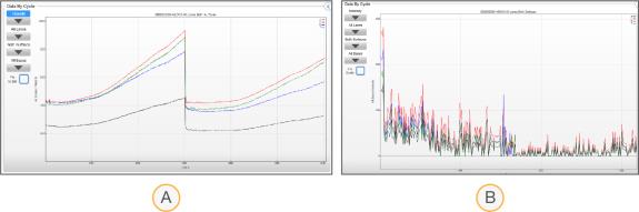
- Normally clustered flow cell
- Midrun failure due to an overclustered flow cell
Overclustering can affect Read 1 or Read 2, but Read 2 is typically more affected. Extra amplification cycles during paired-end resynthesis slightly increase cluster sizes, which can increase the number of overlapping clusters. Overlapping clusters on an overclustered flow cell can affect image registration, causing poor Q30 scores and possible run failure.
Comparison of % ≥ Q30 Profiles in Run Metrics Software
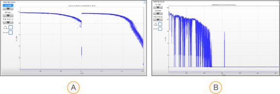
- Normally clustered flow cell
- Large standard deviations preceding run failure due to an overclustered flow cell
Density box plots compare raw cluster density to %PF cluster density. Raw cluster density indicates how many clusters are on the flow cell, while %PF cluster density indicates how many of those clusters passed filter.
With optimal density, the raw cluster density and %PF box plots appear close together. As density increases beyond optimum, the %PF decreases and the box plots appear further apart. Also, clusters might be misidentified so raw cluster density is underestimated. With severe overclustering, no clusters pass filter and the %PF plot is displayed as a horizontal green line at zero density.
In the following figure: blue boxes illustrate raw cluster density range, green boxes illustrate %PF cluster density range, and red lines indicate median cluster density values.
Comparison of Density Box Plots in Run Metrics Software
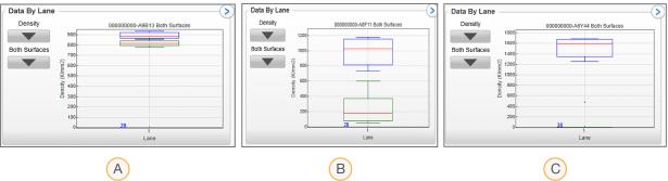
- Optimal density
- Overclustered
- Severely overclustered
When the percentage of clusters passing filter drops to zero, raw cluster density becomes meaningless. Whether you loaded double the amount of library or 10 times the amount of library, the metric remains the same. When zero clusters pass filter, Illumina recommends rechecking libraries (quality and quantity) and incrementally adjusting the loading concentration.
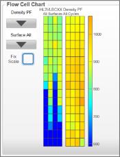
The Flow Cell Chart visualizes metrics for each tile across the entire flow cell. The Density PF view shows a range of cluster densities across all flow cell tiles. The legend (color scale) indicates which values the colors represent and dynamically changes with each run.
| • | With optimal density, the legend displays cluster density values within the recommended range. |
| • | With overclustering, the chart has tiles at the higher end of the color range and can include blue tiles. Blue represents low-density tiles or tiles with zero density due to image extraction failure. |
Density PF in Run Metrics Software Showing Severe Overclustering (HiSeq 2500 System in Rapid Run Mode)
The Intensity view on the Flow Cell Chart is also helpful for evaluating overclustering. Blue or black tiles represent tiles with intensities lower than other tiles due to high cluster density.
Intensity in Run Metrics Software Showing Severe Overclustering
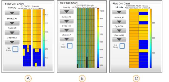
- HiSeq 2500 System in Rapid Run mode
- HiSeq 2500 System in High Output mode
- MiSeq System
